02 /
How can we increase email sign ups and add functionality?
Email capture | 2014
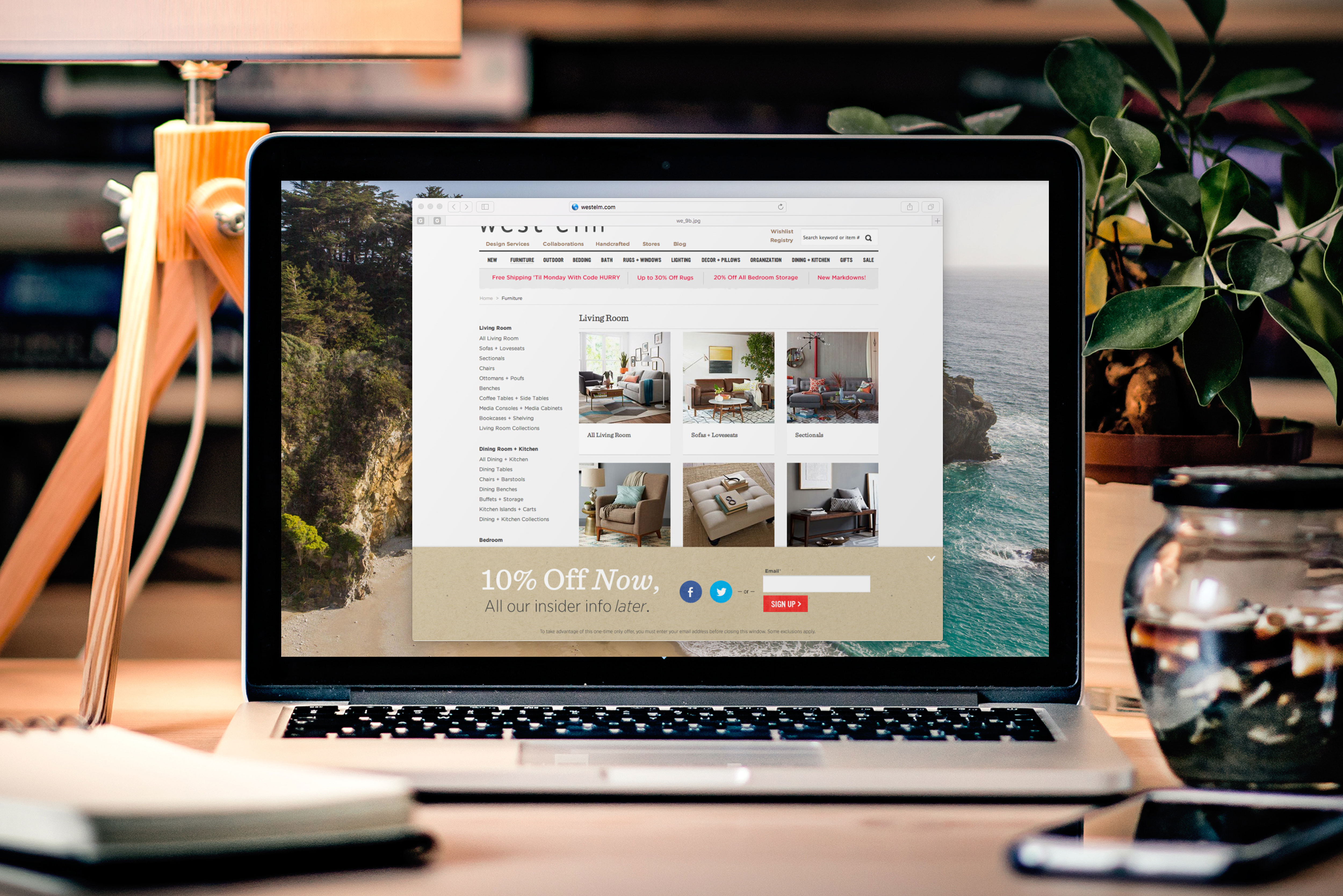
While I was at west elm, I was tasked with updating and improving the then, current email capture. The marketing team asked us to increase the number of email sign up by adding new features and visually overhauling the design. We were also asked to launch the mobile email capture as well.
ROLE
Along with other team members from the copy and development team, we worked together to update the design experience. As a group we came up with a new copy direction and added interactivity to create a better user experience.
Research
Our research consisted of competitive audits and using data from our sister companies on social sign-in features.
Kate Spade Saturday
- Kate Spade Saturday had a very strong mobile and desktop feature by allowing customers to minimize the email capture screen. This allowed customers to have a second chance at inputting their email address.
- We liked this feature because this allowed customers that might have mistakenly clicked off or customers that changed their mind to have a second chance to sign up.
Nasty Gal
- Instead of overlaying a pop-up on screen, there was a subtle animation where it wiggled up from the bottom.
- We thought this feature was beneficial because customers could still shop and didn’t force the customers to exit out of a pop-up screen.
- The animation was also very eye catching and fun which felt very brand aligned.
Other Takeaways
- Due to west elm has a big social following, we had help from the social media team and data from our other sister companies that allowed us to see where are most active customers were. Instagram, facebook, and twitter had some of our biggest followers but we also had a good group following us on google+ and pinterest.
Wireframe + Visual Design
After our competitive audit we started wire-framing and working on the design.
DESKTOP
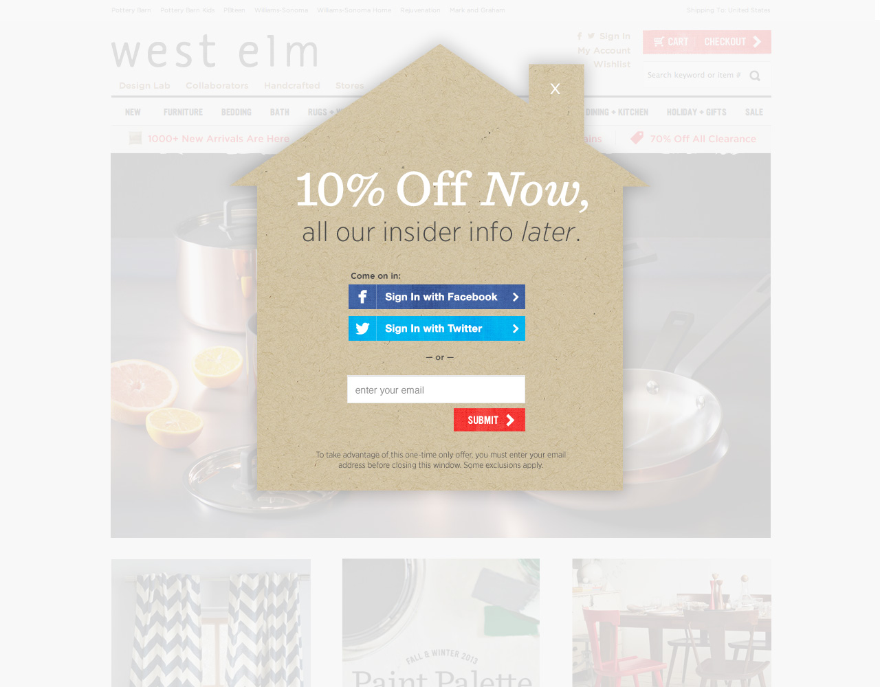
Pop-up desktop email capture
- We decided to show two comps to cover all our bases. Our first comp was the desktop refresh of our current pop-up execution.
- We used a texture which was a known graphic element and gave it a shape that was reflective of the brand. We also introduced social sign in functions through facebook and twitter. Facebook and twitter had the biggest followings so we wanted to include these and skip out on the other social sign ins.
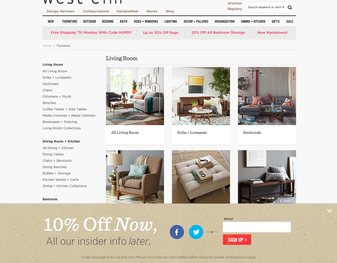
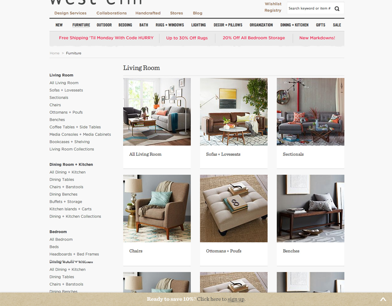
Animating bottom overlay for desktop email capture
Please click through to see more slides- Our second option animated from the bottom that was a overlay on top of the site.
- We made sure customers would be able shop normally by scrolling and clicking through. When the customers decide to engage we implemented Kate Spade Saturday’s minimize function to allow customers to have a second chance at signing up.
- We also had social sign-ins ready for this as well.
MOBILE
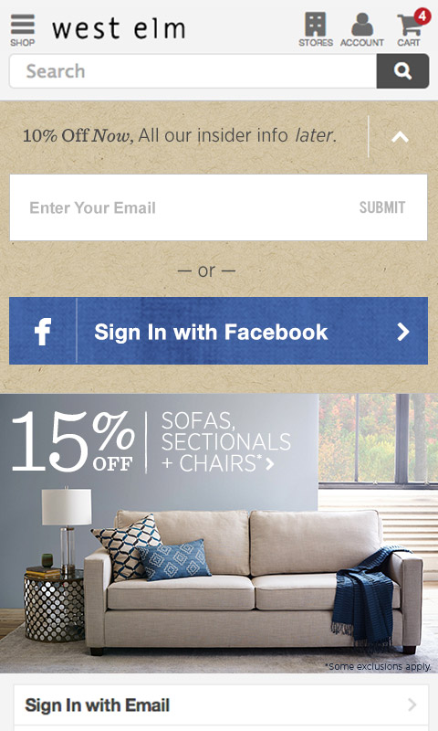

Animating bottom overlay for desktop email capture
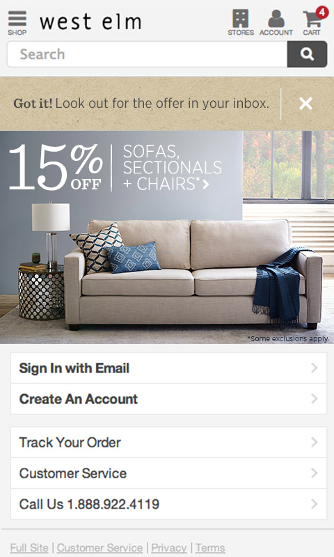
Please click through to see more slides- We used the desktop animations in the mobile as well. Instead of coming from the bottom we wanted to have it on the top as a sticky box that continued to show when customers scrolled down.
- We also included the option to minimize the mobile sign-up as well.
- While we wanted to include both twitter and facebook, due to space we kept the social sign-in with our biggest customer base.
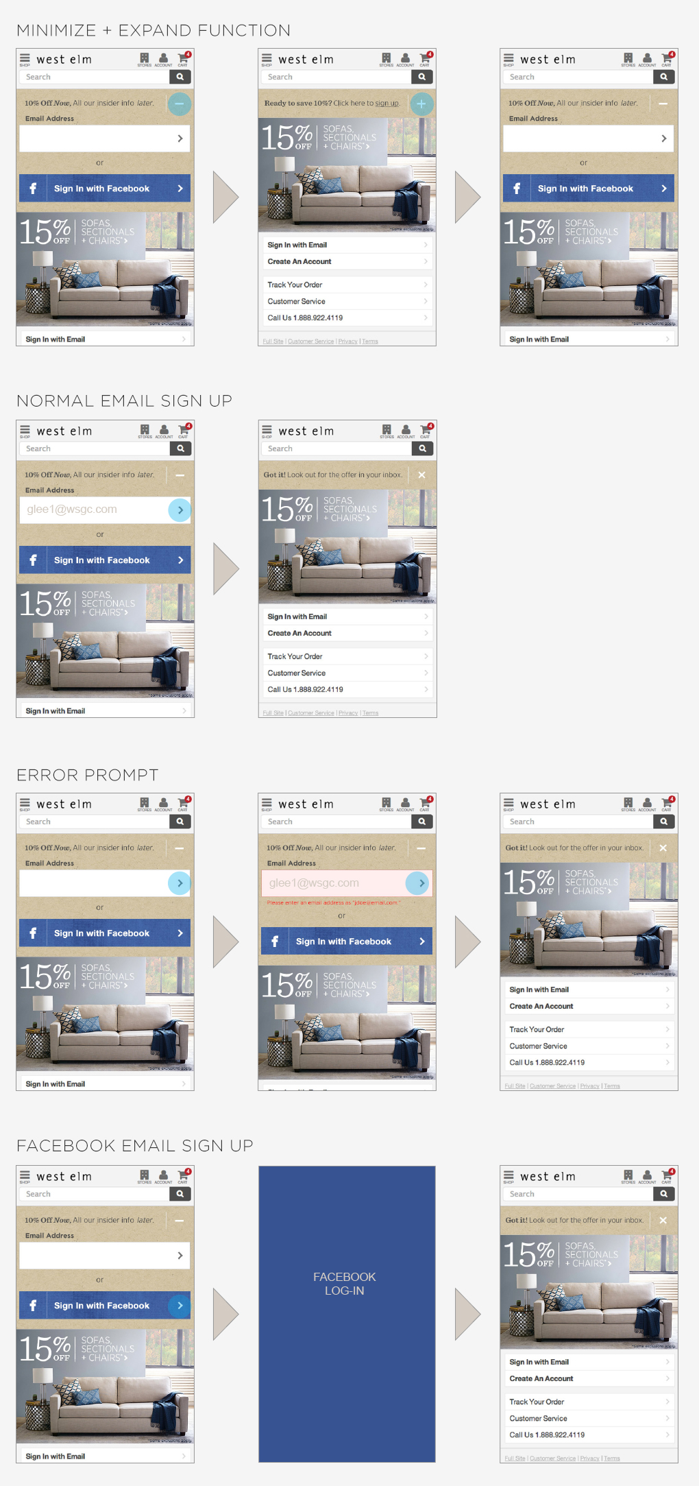
MOBILE USER FLOW
A/B Testing
When we presented these two comps, the marketing team felt that both designs were executed well, but there was concern about a potential drop off in sign ups with the new design. We decided to A/B test this in order to see which performed better. Surprisingly, after weeks of testing, the results concluded that while the bottom animating overlay was cleaner and non-obtrusive, we had fewer customer email sign ups, while the pop-up captured more emails. Moving forward we implemented the new sign-up for mobile but decided to stay with pop-up email sign up on the desktop.