01 /
How do we bring Ashford.com to the modern age without alienating our current customers?
ASHFORD.COM REDESIGN 2017
I joined Ashford Innovations Lab to help improve the mobile experience. Together with my team and I, we worked on various concepts for different site experiences and brought a UX voice into the task at hand.
ROLE
This process took a ton of exploration, prototyping, testing and is still on-going. Along with my director, UI designer and developer, we started building the site from the ground up with a mobile first approach.
Research
Due to the small size of the company, they didn't have a set person that could make sense of the collected data. Our first objective was to collect and analyze the data, as well as connect with customer facing teams such as the sales and customer support teams.
Business Requirements
Before we started, we also had to recognize the business needs. Our mobile site needed to be revamped and we had a serious issue with the checkout process. Customers engagement constantly dropped off during checkout. Another issue was our large international customer base, we needed to find better ways to accomodate the various payment methods.
Setting Goals
Once, we understood the business needs, we began putting together a roadmap and setting broader goals for the redesign. Immediately, we knew we needed to make it easier for customers to checkout, use different payment options, be able to bring a better mobile experience. Accessibility had to be improved by introducing consistent fonts and fix the navigation and filtering system.
Findings
After setting up a roadmap and aligning with our business needs, my team and I began a handful of internal interviews. We chatted with the various teams dealing with customers to understand where certain pain points where. Here are some findings.
- Currently, men's watches have higher sales than women and have stayed consistent year over year. Sales for women have dropped by 7 million from 2015 to 2016 and have stayed down since then.
- The Chinese language has had the biggest increase compared to other languages year over year.
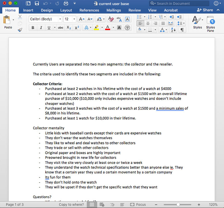
- There's a big reseller customer base that have purchased 20 or more units in the past two years. We created an archetype for these customers and called them resellers.
- Some customers repeat purchases of 2 watches of at least $4000 in the higher margin segment. This became our second archetype and we called them the collectors. These high spenders care about original paperwork and boxes and look to sell eventually.
- Customers were getting overwhelmed with information, they hardly used the filtering options because the process felt confusing.
- We were losing customers at the checkout process, due to confusion and lack of relevant information. Customers would complain of the checkout process and just call the customer sales team to put their order in.
Once the quantitative and qualitative data made sense, we put together a design prototype to test internally. We sent our team members invision links and used the liveshare feature to record all their sessions.
Due to the testing we were able to improve and iterate on naming and placement of different form fields. We also brought the country up first in order to make it more user friendly for our international customers.
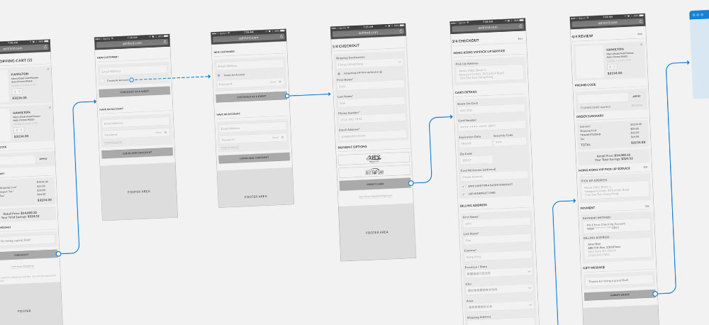
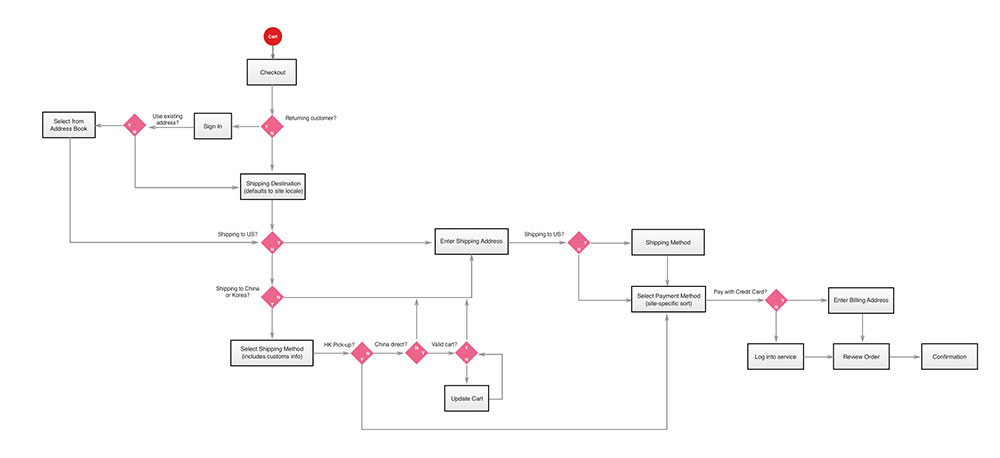
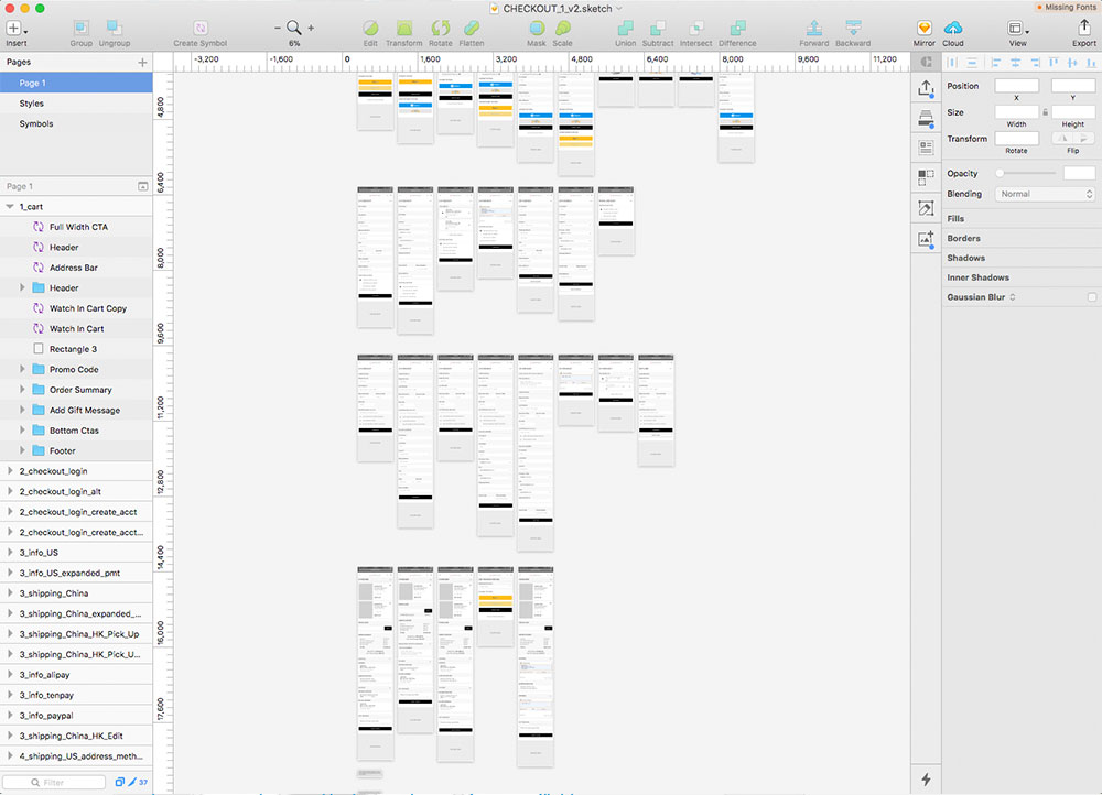
Wireframes
These wireframes are the features our team prioritized.
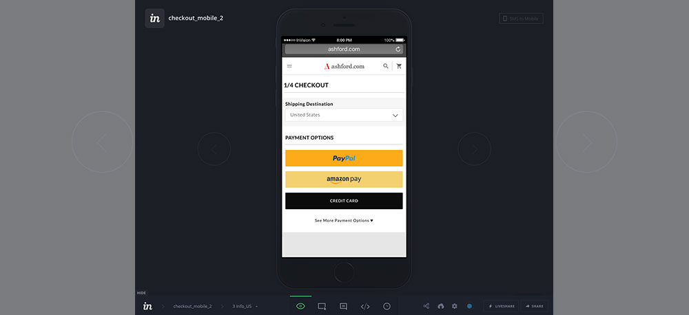
Payment Methods That Show Up Dynamically
We offer our customers various payment methods such as Paypal and Amazon Pay. One issue our customers faced were that these payment methods showed up after inputting all of the customers information. We placed this earlier in the process so customers could take advantage and dynamically pull the information from their database.
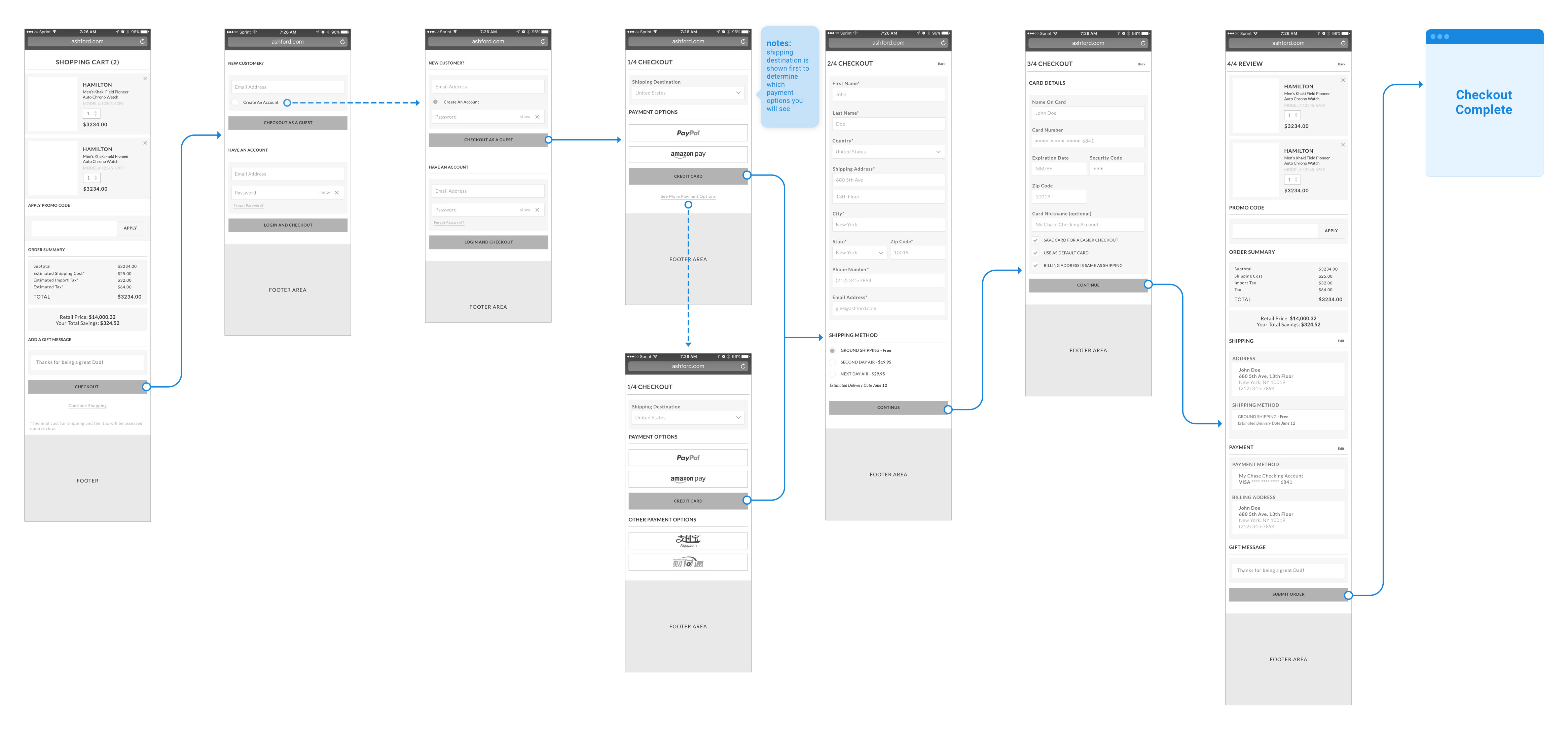
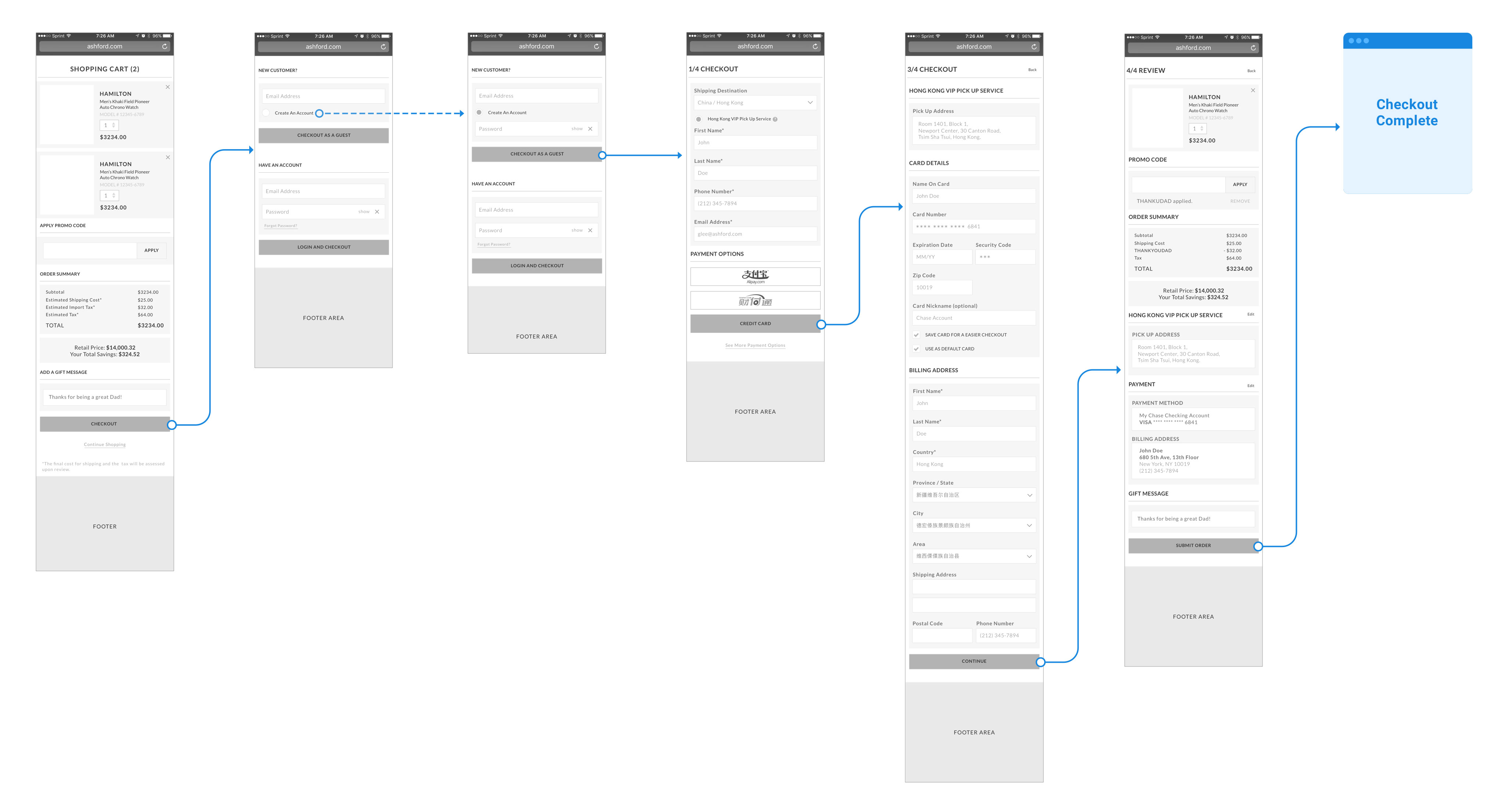
International Payment Options
We also had to include payments for our Chinese customers such as Tenpay, Alipay and Hong Kong Pick up service. This presented some challenges because, we didn't want our North American customers to see these options. We decided to present the country first. This gave us the opportunity to show different payment methods depending on the shipping country. We also introduced a progressive flow of information rather than overwhelming customers.
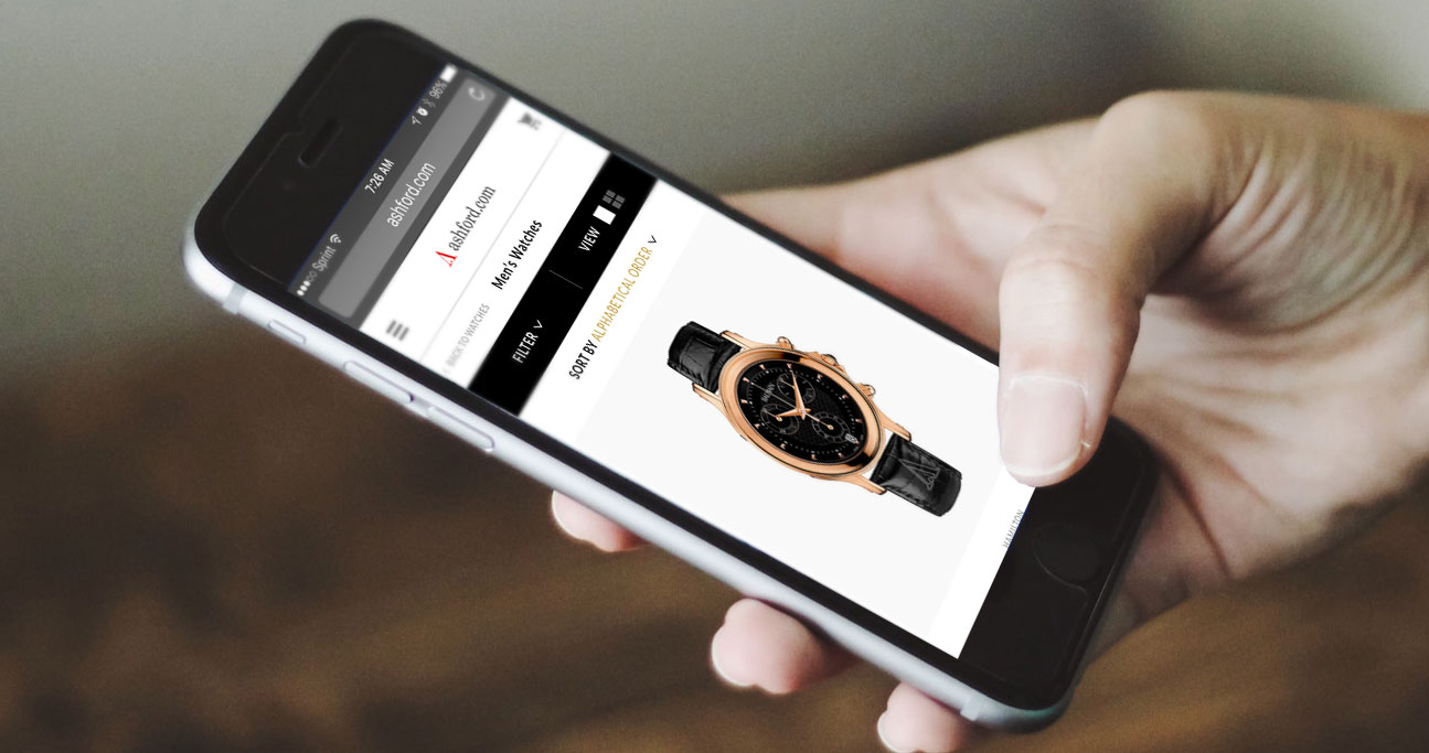
Better UI for mobile
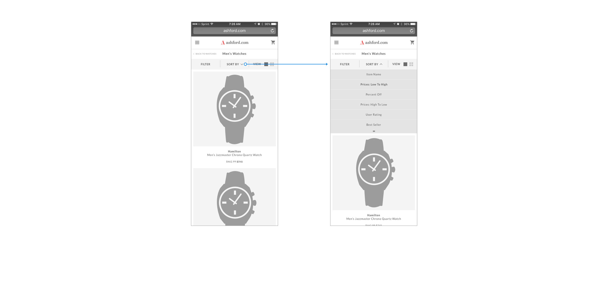
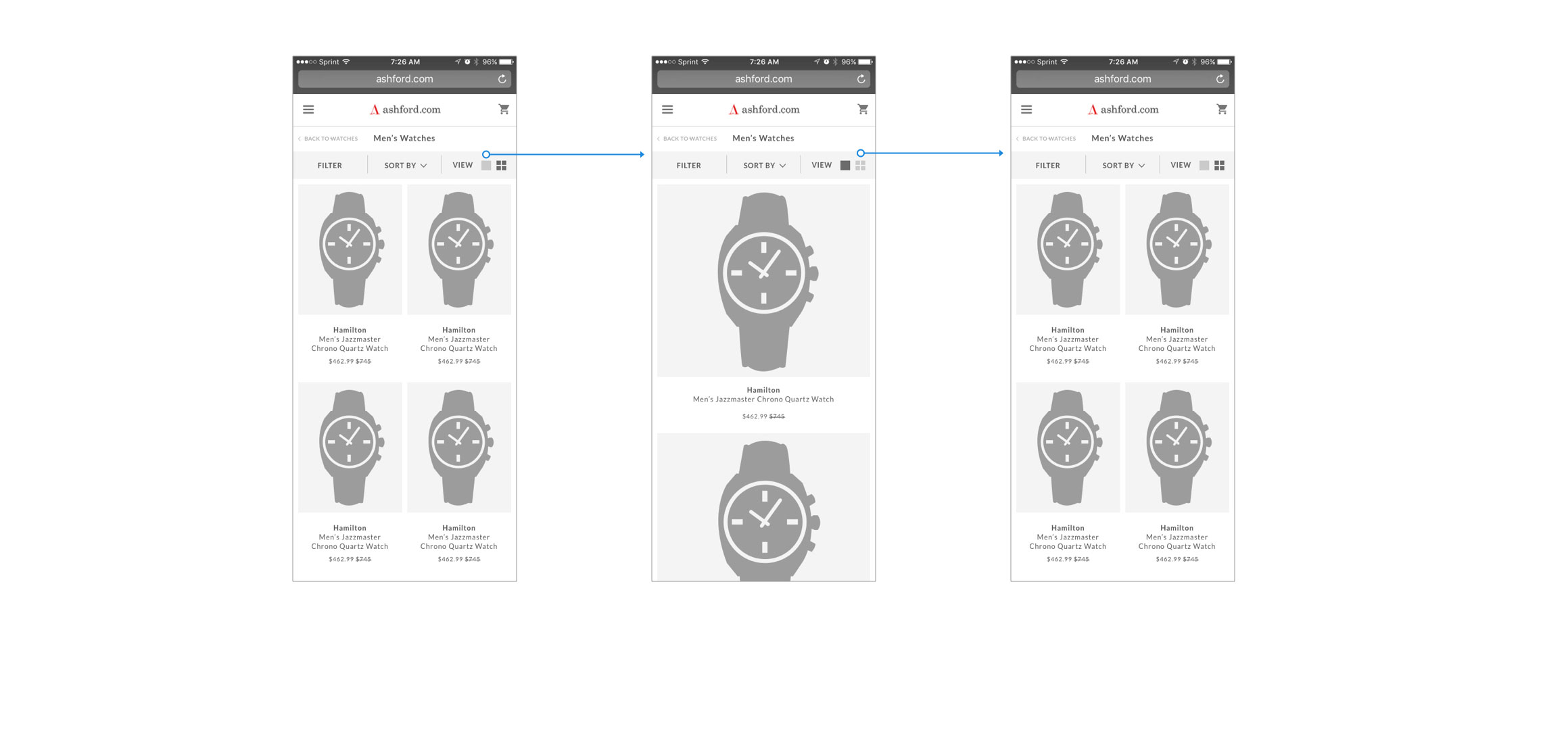
Filters for our mobile site were convoluted and they pushed content down. It felt overwhelming and it confused our customers. Through multiple options and testing we've decided to incorporate a progressive flow on the filtering system as well.
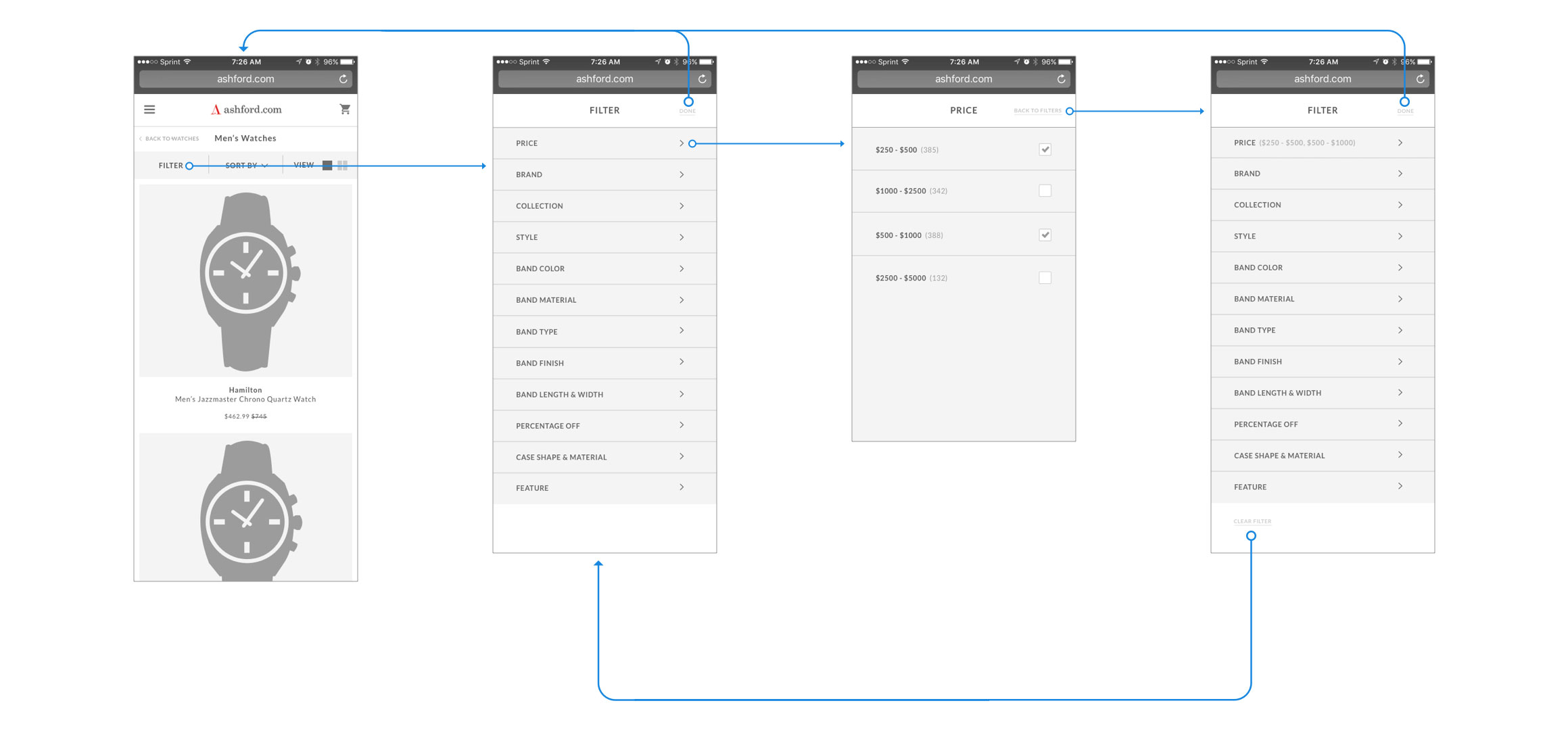
We kept relevant information on top and simplified what customers needed immediately. Just filter, sort and views were included.
Navigation
Our navigation needed to be revamped as well. We decided to create an slide out overlay so customers always knew where they were and gave it more type hierarchy so the information was easier to understand.
